Originally published at cruip.com
--
In this tutorial, we will walk you through a simple technique to make your post layouts more dynamic and visually appealing to your readers. Precisely, we will show you how to make your images extend beyond the horizontal width of their containers. This technique breaks the monotony of a single-column layout, adds depth, and enhances the reading experience on desktop and mobile devices.
We’ve applied this technique to our templates multiple times. For example, in our simple website template called Simple and our elegant HTML website template called Tidy.
Creating the article container
Let’s get started by creating the container for your article. We’ll use an article tag and set a maximum width for it. It’s a good design practice to limit the width of the text to ensure better readability. Ideally, you should aim for less than 85 characters per line.
For this example, let’s assume a font size of 16px. To maintain fewer than 85 characters per line, the maximum width of our container should be 640px. Although Tailwind CSS doesn’t provide a ready-made class for this value, we can create a custom class with the desired width using an arbitrary value:
<article class="max-w-[40rem] mx-auto">
</article>
Using arbitrary variants to control content styling
Next, inside the article tag, we’ll structure our content by creating a header tag to contain the post title, and a div to hold the post content.
<article class="max-w-[40rem] mx-auto">
    <header class="mb-4">
        <h1 class="text-4xl font-extrabold text-slate-900">How I Became Who I Am Today</h1>
    </header>
    <div class="text-slate-600 [&>p]:my-6 [&>p:first-child]:mt-0 [&>p:last-child]:mb-0 [&_strong]:font-medium [&_strong]:text-slate-900 [&_a]:font-medium [&_a]:text-indigo-500 [&_a]:underline [&_a:hover]:no-underline [&_img]:rounded-xl [&_blockquote]:italic [&_blockquote]:before:block [&_blockquote]:before:w-[18px] [&_blockquote]:before:h-[17px] [&_blockquote]:before:bg-[url('./quotes.svg')] [&_blockquote]:before:bg-no-repeat [&_blockquote]:before:mb-2 [&_figcaption]:text-center [&_figcaption]:text-xs [&_figcaption]:italic [&_figcaption]:mt-3">
    </div>
</article>
As you may have noticed, we have added a series of custom classes to the div element, utilizing the arbitrary variants introduced in Tailwind CSS v3.1.0. These classes allow us to define the styles for recurring tags used within the article directly on the parent div. This approach eliminates the need to apply Tailwind CSS utility classes to each individual element.
Here’s a breakdown of the custom classes we have defined:
Margins for p tags (
[&>p]:my-6,[&>p:first-child]:mt-0,[&>p:last-child]:mb-0)Style for strong tags (
[&_strong]:font-medium,[&_strong]:text-slate-900)Style for a tags (
[&_a]:font-medium,[&_a]:text-indigo-500,[&_a]:underline,[&_a:hover]:no-underline)Style for img tags (
[&_img]:rounded-xl)Style for blockquote tags (
[&_blockquote]:italic,[&_blockquote]:before:block,[&_blockquote]:before:w-[18px],[&_blockquote]:before:h-[17px],[&_blockquote]:before:bg-[url('./quotes.svg')],[&_blockquote]:before:bg-no-repeat,[&_blockquote]:before:mb-2)Style for figcaption tags (
[&_figcaption]:text-center,[&_figcaption]:text-xs,[&_figcaption]:italic,[&_figcaption]:mt-3)
While we could have used the Tailwind CSS Typography plugin, we chose this solution to have more control over the tag styles and avoid overriding the plugin’s default styles. Since this demo utilizes only a few elements, this choice is appropriate.
Adding article content
Now, let’s refocus on the objective of our tutorial and continue with inserting the post content. After the first plain text paragraph, we intend to include an image aligned to the left, accompanied by a quote. To achieve this, we’ll utilize flexbox to display the two elements side by side on desktop screens.
Therefore, we’ll require a wrapper for both elements:
<p>
    Once upon a time, in a bustling city, Alex lived and breathed software development. The world of coding fascinated me, and I was <strong>determined to leave my mark on it</strong>. With a passion for <a href="#0">innovation</a> and a desire to create, I embarked on a journey that would forever change my life.
</p>
<div class="space-y-6 sm:flex sm:items-center sm:space-x-8 sm:space-y-0">
    <figure class="shrink-0 sm:max-w-[270px]">
        <img width="640" height="426" src="./article-01.jpg" alt="Article 01" />
    </figure>
    <blockquote>
        <p>Looking back on my journey, I realized that becoming popular wasn't just about the numbers or the recognition—it was about the impact I had on others and the possibility of helping by sharing my personal and professional knowledge.</p>
    </blockquote>
</div>
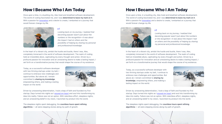
Starting from the sm breakpoint (which corresponds to a screen width of 640 pixels), the two elements will be displayed side by side using the sm:flex class, and the image will have a maximum width of 270 pixels (sm:max-w-[270px]).
Now, let’s add another text paragraph and insert an image aligned to the right, accompanied by another text paragraph. Similarly, we’ll use flexbox to display the two elements side by side on desktop screens. Hence, we’ll need a wrapper for both elements:
<p>
    In the heart of a vibrant city, amidst the hustle and bustle, there I was, Alex, completely immersed in the world of software development. The realm of coding held an irresistible allure, captivating my every thought and action. Driven by a profound passion for innovation and an unwavering desire to make a lasting impact, I set forth on a transformative journey that would shape the course of my existence.
</p>
<div class="space-y-6 sm:flex sm:items-center sm:space-x-8 sm:space-y-0">
    <p>
        Today, as a successful software developer with two thriving startups under my belt, I continue to embrace new challenges and opportunities. But above all, I remain committed to <strong>sharing my knowledge</strong>, empowering others, and making a lasting impact on the world.
    </p>
    <figure class="shrink-0 sm:max-w-[270px]">
        <img width="640" height="426" src="./article-02.jpg" alt="Article 02" />
    </figure>
</div>
Finally, to conclude the article, let’s add more text and a full-width image:
<p>
    Driven by unwavering determination, I took a leap of faith and founded my first startup. Days turned into nights as I <a href="#0">poured my heart</a> and soul into transforming my idea into reality. Failure was not an option. With relentless effort, sleepless nights, and an unwavering belief in my vision, I launched my product into the world.
</p>
<p>
    The sleepless nights spent debugging, the <strong>countless hours spent refining algorithms</strong> — all were stepping stones along my path of growth.
</p>
<figure>
    <img width="736" height="240" src="./article-03.jpg" alt="Article 03" />
    <figcaption>Moments of tranquility amidst nature's beauty</figcaption>
</figure>
<p>
    As I delved deeper into the intricacies of programming, a whole new universe of possibilities unfurled before me. Lines of code danced across my screen like a symphony, each keystroke resonating with the potential to bring my visions to life. From the early days of tinkering with simple programs to the <a href="#0">ambitious projects</a> that followed, my thirst for knowledge and creative expression grew insatiable.
</p>
To add visual interest and break the monotony of the layout, we can create a staggered effect for the images by applying negative margins to their parent elements. However, we will only do this starting from a certain breakpoint to prevent the images from going off-screen on smaller devices.
Using negative margins to offset image positioning

In the first div, let’s use the class md:-ml-12. This class applies a left negative margin of 48 pixels starting from the md breakpoint (corresponding to a screen width of 768 pixels). By doing this, the image will be shifted further to the left compared to the text, creating a staggered effect:
<div class="... md:-ml-12"> ...
For the second div, we will instead use the class md:-mr-12, which applies a right negative margin of 48 pixels. This way, the image will be shifted further to the right compared to the text:
<div class="... md:-mr-12"> ...
Finally, for the container element of the full-width image, let’s add the class md:-mx-12. This class applies a left and right negative margin of 48 pixels starting from the md breakpoint (corresponding to a screen width of 768 pixels). As a result, the image will become larger and extend beyond both the left and right limits of the article body, creating a visually impactful full-width display:
<figure class="md:-mx-12"> ...
Great, we made the layout more dynamic, but we have also provided more space for text alongside the images, thus improving the readability of the content.
Further improvements for smaller screens
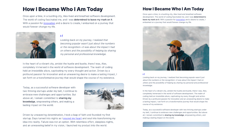
Let’s examine the final result:

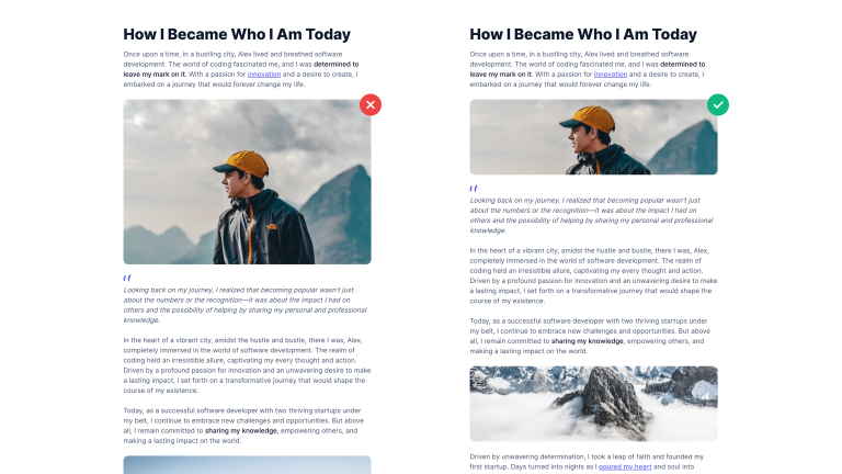
As you can see, on smaller screens, the first two images tend to dominate the layout, occupying an excessive amount of space. This imbalance affects the visual hierarchy. To address this, let’s proceed with functional resizing to restore a more harmonious visual composition.
Considering the limited horizontal space on mobile devices, we can try reducing the height of the images. By defining a specific height for the images on smaller screens and utilizing the CSS property object-fit, we can ensure that the image covers the entire area and remains centered within the canvas:
<img class="object-cover h-[180px] sm:h-auto" width="640" height="426" src="./article-01.jpg" alt="Article 01" />
The resulting effect is much more balanced as it gives the right proportions to the text and images within the text:

Here’s the finalized code:
<article class="max-w-[40rem] mx-auto">
    <header class="mb-4">
        <h1 class="text-4xl font-extrabold text-slate-900">How I Became Who I Am Today</h1>
    </header>
    <div class="text-slate-600 [&>p]:my-6 [&>p:first-child]:mt-0 [&>p:last-child]:mb-0 [&_strong]:font-medium [&_strong]:text-slate-900 [&_a]:font-medium [&_a]:text-indigo-500 [&_a]:underline [&_a:hover]:no-underline [&_img]:rounded-xl [&_blockquote]:italic [&_blockquote]:before:block [&_blockquote]:before:w-[18px] [&_blockquote]:before:h-[17px] [&_blockquote]:before:bg-[url('./quotes.svg')] [&_blockquote]:before:bg-no-repeat [&_blockquote]:before:mb-2 [&_figcaption]:text-center [&_figcaption]:text-xs [&_figcaption]:italic [&_figcaption]:mt-3">
        <p>
            Once upon a time, in a bustling city, Alex lived and breathed software development. The world of coding fascinated me, and I was <strong>determined to leave my mark on it</strong>. With a passion for <a href="#0">innovation</a> and a desire to create, I embarked on a journey that would forever change my life.
        </p>
        <div class="space-y-6 sm:flex sm:items-center sm:space-x-8 sm:space-y-0 md:-ml-12">
            <figure class="shrink-0 sm:max-w-[270px]">
                <img class="object-cover h-[180px] sm:h-auto" width="640" height="426" src="./article-01.jpg" alt="Article 01" />
            </figure>
            <blockquote>
                <p>Looking back on my journey, I realized that becoming popular wasn't just about the numbers or the recognition—it was about the impact I had on others and the possibility of helping by sharing my personal and professional knowledge.</p>
            </blockquote>
        </div>
        <p>
            In the heart of a vibrant city, amidst the hustle and bustle, there I was, Alex, completely immersed in the world of software development. The realm of coding held an irresistible allure, captivating my every thought and action. Driven by a profound passion for innovation and an unwavering desire to make a lasting impact, I set forth on a transformative journey that would shape the course of my existence.
        </p>
        <div class="space-y-6 sm:flex sm:items-center sm:space-x-8 sm:space-y-0 md:-mr-12">
            <p>
                Today, as a successful software developer with two thriving startups under my belt, I continue to embrace new challenges and opportunities. But above all, I remain committed to <strong>sharing my knowledge</strong>, empowering others, and making a lasting impact on the world.
            </p>
            <figure class="shrink-0 sm:max-w-[270px]">
                <img class="object-cover h-[180px] sm:h-auto" width="640" height="426" src="./article-02.jpg" alt="Article 02" />
            </figure>
        </div>
        <p>
            Driven by unwavering determination, I took a leap of faith and founded my first startup. Days turned into nights as I <a href="#0">poured my heart</a> and soul into transforming my idea into reality. Failure was not an option. With relentless effort, sleepless nights, and an unwavering belief in my vision, I launched my product into the world.
        </p>
        <p>
            The sleepless nights spent debugging, the <strong>countless hours spent refining algorithms</strong> — all were stepping stones along my path of growth.
        </p>
        <figure class="md:-mx-12">
            <img class="object-cover h-[180px] sm:h-auto" width="736" height="240" src="./article-03.jpg" alt="Article 03" />
            <figcaption>Moments of tranquility amidst nature's beauty</figcaption>
        </figure>
        <p>
            As I delved deeper into the intricacies of programming, a whole new universe of possibilities unfurled before me. Lines of code danced across my screen like a symphony, each keystroke resonating with the potential to bring my visions to life. From the early days of tinkering with simple programs to the <a href="#0">ambitious projects</a> that followed, my thirst for knowledge and creative expression grew insatiable.
        </p>
    </div>
</article>
Conclusions
We hope you found this tutorial helpful and that you will apply the techniques to your blog designs to give them a more dynamic look and feel.
If you’re interested in learning more about our tips and techniques, look at our section of Tailwind CSS tutorials, or if you’re looking for a ready-made solution for your next project, check out our Tailwind CSS templates.
