


Originally published at cruip.com
--
Modal video components are increasingly used in modern web design because they allow for quickly watching a video without leaving the page and focusing on the content without too many distractions. We have implemented this type of component in many of our templates (for example, in Open Pro, a SaaS website template, and Simple, a simple website template), and we can guarantee that our customers have greatly appreciated their use.
As you may have guessed, in this tutorial, we will learn how to create a modal video component using two powerful front-end tools: Tailwind CSS and Alpine.js. By combining the power of Tailwind CSS and Alpine.js, we can create a sleek and functional modal video component for every type of web application. Are you ready? Let’s get started!
Assuming you haven’t set up your environment yet, let’s create a simple HTML page and import Tailwind CSS and Alpine.js via the CDN. Although this is not the recommended approach for production websites, it’s okay for our experiment.
<!DOCTYPE html>
<html lang="en">

<head>
    <meta charset="utf-8">
    <title>Modal Video</title>
    <meta name="viewport" content="width=device-width,initial-scale=1">
    <link rel="preconnect" href="https://fonts.googleapis.com">
    <link rel="preconnect" href="https://fonts.gstatic.com" crossorigin>
    <link href="https://fonts.googleapis.com/css2?family=Inter:wght@400;500&display=swap" rel="stylesheet">
    <script src="https://cdn.tailwindcss.com"></script>
    <script defer src="https://cdn.jsdelivr.net/npm/alpinejs@3.x.x/dist/cdn.min.js"></script>
    <script>
        tailwind.config = {
            theme: {
                extend: {
                    fontFamily: {
                        inter: ['Inter', 'sans-serif'],
                    },
                },
            },
        };
    </script>
</head>

<body class="font-inter antialiased h-screen px-6 py-6 md:py-8">
    <div class="h-full flex flex-col justify-center">

        <main class="my-6">
            <div class="w-full max-w-6xl mx-auto">
                <div class="flex justify-center">

                    <!-- Modal video -->

                </div>
            </div>
        </main>

    </div>
</body>

</html>
Create the modal video structure with HTML and Tailwind CSS
The first step is to create the HTML structure for the modal video using Tailwind CSS classes to style the elements. This includes the following:
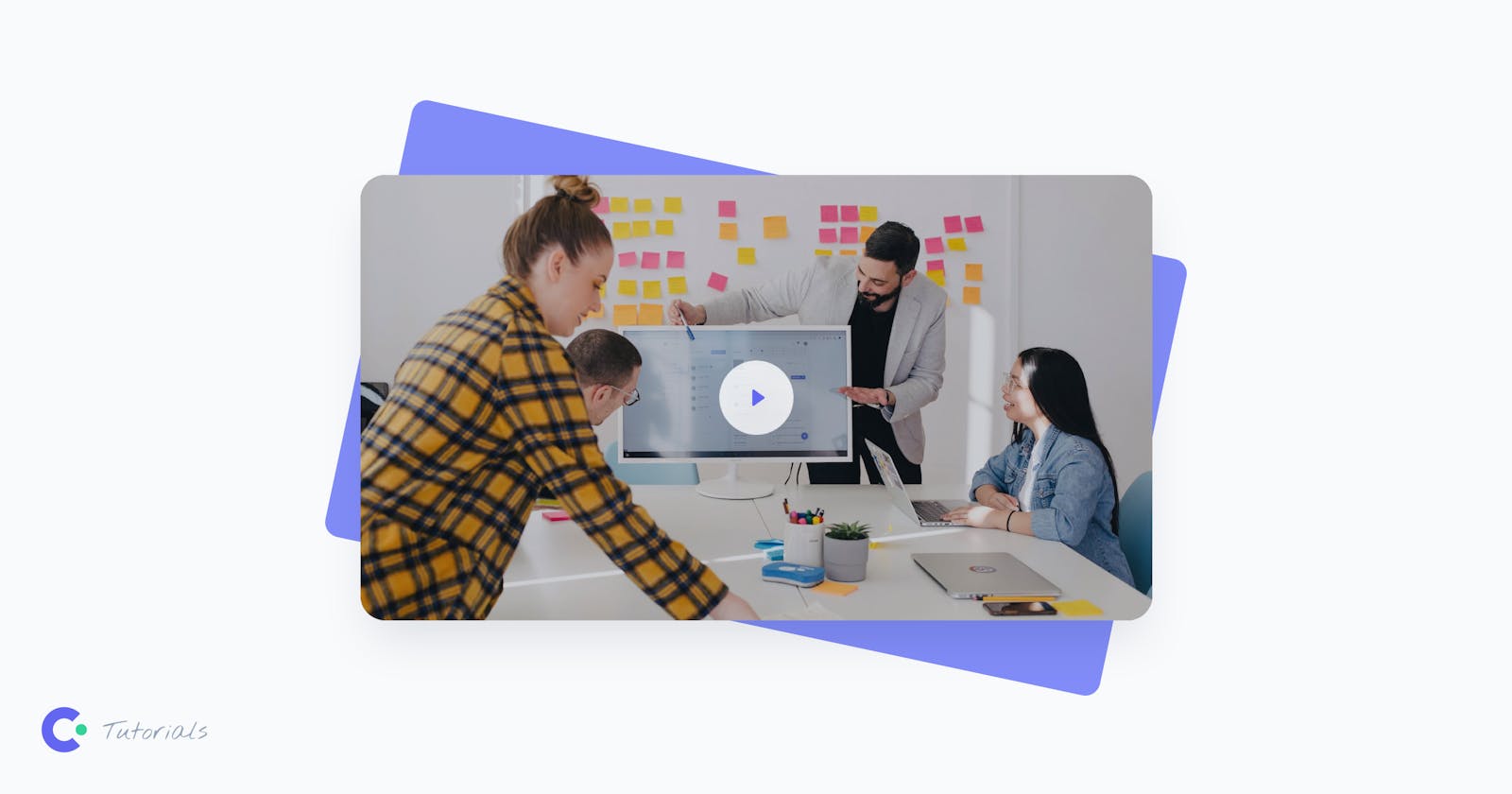
The button: This is the clickable element that triggers the opening of the modal. The button contains a thumbnail image of the video and a play button icon. We have also added ARIA attributes for accessibility.
The backdrop layer: This is the dark background that appears behind the modal when it is open. It covers the entire screen and is partially transparent to allow the background to be visible.
The modal video: This is the actual video that plays in the modal. It is positioned in the center of the screen.
<!-- 1. The button -->
<button
    class="relative flex justify-center items-center focus:outline-none focus-visible:ring focus-visible:ring-indigo-300 rounded-3xl group"
    @click="modalOpen = true"
    aria-controls="modal"
    aria-label="Watch the video"
>
    <img class="rounded-3xl shadow-2xl transition-shadow duration-300 ease-in-out" src="./video-modal-thumb.jpg" width="768" height="432" alt="Modal video thumbnail" />
    <!-- Play icon -->
    <svg class="absolute pointer-events-none group-hover:scale-110 transition-transform duration-300 ease-in-out" xmlns="http://www.w3.org/2000/svg" width="72" height="72">
        <circle class="fill-white" cx="36" cy="36" r="36" fill-opacity=".8" />
        <path class="fill-indigo-500 drop-shadow-2xl" d="M44 36a.999.999 0 0 0-.427-.82l-10-7A1 1 0 0 0 32 29V43a.999.999 0 0 0 1.573.82l10-7A.995.995 0 0 0 44 36V36c0 .001 0 .001 0 0Z" />
    </svg>
</button>

<!-- 2. The backdrop layer -->
<div class="fixed inset-0 z-[99999] bg-black bg-opacity-50 transition-opacity"></div>

<!-- 3. The modal video -->
<div id="modal" class="fixed inset-0 z-[99999] flex p-6" role="dialog" aria-modal="true">
    <div class="max-w-5xl mx-auto h-full flex items-center">
        <div class="w-full max-h-full rounded-3xl shadow-2xl aspect-video bg-black overflow-hidden">
            <video width="1920" height="1080" loop controls>
                <source src="./video.mp4" type="video/mp4" />
                Your browser does not support the video tag.
            </video>
        </div>
    </div>
</div>
Define the modal initial state with Alpine.js
The next step is to define the initial state of the modal using Alpine.js. This involves creating an x-data attribute on a parent element and assigning it an object with properties that represent the state of the modal.
In this case, we want to create a property called modalOpen with an initial value of false. This sets the initial state of the modal to be closed, and allows us to toggle its state later.
<div x-data="{ modalOpen: false }">
    <!-- 1. The button -->
    <!-- 2. The backdrop layer -->
    <!-- 3. The modal video -->
</div>
Then, we need to bind the visibility of the modal and its backdrop to the modalOpen state. We use the x-show directive on both the backdrop and the modal to tell Alpine when to show or hide these elements based on the modalOpen state. So, we hide them when the state is false and show them when it’s true.
<div x-data="{ modalOpen: false }">

    <!-- 1. The button -->
    <button ...>

    <!-- 2. The backdrop layer -->
    <div x-show="modalOpen" ...>

    <!-- 3. The modal video -->
    <div x-show="modalOpen" ...>

</div>
Toggling the modal state
Now, we need to add an event listener to the button element that toggles the modalOpen property when the button is clicked. This is done using the @click directive (shorthand x-on:click). When the button is clicked, the value of modalOpen is changed to true, which triggers the display of the backdrop layer and the modal video.
<div x-data="{ modalOpen: false }">

    <!-- 1. The button -->
    <button @click="modalOpen = true" ...>

    <!-- 2. The backdrop layer -->
    <div x-show="modalOpen" ...>

    <!-- 3. The modal video -->
    <div x-show="modalOpen" ...>

</div>
Cool! Now we want to change modalOpen to false – and close the modal – when clicking outside the modal dialog, or when pressing the ESC key.
To achieve this, we use the @click.outside and @keydown.escape.window directives on the div which contains the video.
<div x-data="{ modalOpen: false }">

    <!-- 1. The button -->
    <button @click="modalOpen = true" ...>

    <!-- 2. The backdrop layer -->
    <div x-show="modalOpen" ...>

    <!-- 3. The modal video -->
    <div x-show="modalOpen">
        <div class="max-w-5xl mx-auto h-full flex items-center">
            <div
            class="w-full max-h-full rounded-3xl shadow-2xl aspect-video bg-black overflow-hidden"
            @click.outside="modalOpen = false"
            @keydown.escape.window="modalOpen = false"
        >
                <video width="1920" height="1080" loop controls>
                    <source src="./video.mp4" type="video/mp4" />
                    Your browser does not support the video tag.
                </video>
            </div>
        </div>
    </div>

</div>
Great! We can now toggle the modal open and closed. However, we want to make the experience smoother by adding transitions between the states of the modal.
Adding enter and leave transitions
Traditionally, implementing transitions between when an element is shown or hidden can be challenging. But, Alpine.js provides a x-transition utility that makes it easy to apply transition effects.
Since the x-transition directive is already well-documented, I won’t go into detail about how it works here. Instead, let’s see how we can use this powerful feature in conjunction with Tailwind CSS to create a scale-up transition effect on entering the modal, and scale-down effect when exiting the modal.
<div x-data="{ modalOpen: false }">

    <!-- 1. The button -->
    <button @click="modalOpen = true" ...>

    <!-- 2. The backdrop layer -->
    <div
        x-show="modalOpen"
        x-transition:enter="transition ease-out duration-200"
        x-transition:enter-start="opacity-0"
        x-transition:enter-end="opacity-100"
        x-transition:leave="transition ease-out duration-100"
        x-transition:leave-start="opacity-100"
        x-transition:leave-end="opacity-0"
    ...>

    <!-- 3. The modal video -->
    <div
        x-show="modalOpen"
        x-transition:enter="transition ease-out duration-300"
        x-transition:enter-start="opacity-0 scale-75"
        x-transition:enter-end="opacity-100 scale-100"
        x-transition:leave="transition ease-out duration-200"
        x-transition:leave-start="opacity-100 scale-100"
        x-transition:leave-end="opacity-0 scale-75"
    ...>

</div>
Controlling video playback with modal state changes
To enhance the user experience, it’s important to automatically pause the video when the modal is closed and resume it when the modal is opened again.
This can be achieved by listening for changes in the modalOpen state and playing or pausing the video accordingly. Fortunately, Alpine.js provides a handy $watch method that enables us to accomplish this:
<video x-init="$watch('modalOpen', value => value ? $el.play() : $el.pause())" width="1920" height="1080" loop controls>
    <source src="./video.mp4" type="video/mp4" />
</video>
Final Touches
Our component is almost complete, but we need to make some final adjustments to ensure it’s fully accessible and prevent any content from flickering on page load.
Improving Accessibility
To make our modal fully accessible, we assign the role="dialog", aria-modal="true", and an id that corresponds to the aria-controls attribute assigned to the button element. This indicates that the button is capable of controlling the dialog.
Since the button doesn’t have any text to describe its content, we add the aria-label="Watch the video" attribute.
We also want to remove the button’s outline on click while maintaining accessibility requirements. For this, we add some Tailwind CSS classes that remove the outline on click (focus:outline-none) and enable focus for keyboard users (focus-visible:ring focus-visible:ring-indigo-300).
Additionally, we assign the aria-hidden="true" attribute to the backdrop to indicate that it’s purely decorative.
Preventing hidden content from flickering on page load
By default, the modal is hidden on page load, but there’s a moment during navigation when Alpine.js isn’t fully loaded on the page. As a result, any elements that are supposed to be hidden will flicker on page load.
To avoid this, we can use the x-cloak directive to hide the elements that should be hidden by default (in our case, the backdrop and the modal), and add the Tailwind CSS class [&_[x-cloak]]:hidden that sets a display: none rule to a parent tag.
Conclusions
And here’s the final result of the modal video component that we developed together, ready to be included in any web app, website, or landing page:
<div class="[&_[x-cloak]]:hidden" x-data="{ modalOpen: false }">

    <!-- Video thumbnail -->
    <button
        class="relative flex justify-center items-center focus:outline-none focus-visible:ring focus-visible:ring-indigo-300 rounded-3xl group"
        @click="modalOpen = true"
        aria-controls="modal"
        aria-label="Watch the video"
    >
        <img class="rounded-3xl shadow-2xl transition-shadow duration-300 ease-in-out" src="./video-modal-thumb.jpg" width="768" height="432" alt="Modal video thumbnail" />
        <!-- Play icon -->
        <svg class="absolute pointer-events-none group-hover:scale-110 transition-transform duration-300 ease-in-out" xmlns="http://www.w3.org/2000/svg" width="72" height="72">
            <circle class="fill-white" cx="36" cy="36" r="36" fill-opacity=".8" />
            <path class="fill-indigo-500 drop-shadow-2xl" d="M44 36a.999.999 0 0 0-.427-.82l-10-7A1 1 0 0 0 32 29V43a.999.999 0 0 0 1.573.82l10-7A.995.995 0 0 0 44 36V36c0 .001 0 .001 0 0Z" />
        </svg>
    </button>
    <!-- End: Video thumbnail -->

    <!-- Modal backdrop -->
    <div
        class="fixed inset-0 z-[99999] bg-black bg-opacity-50 transition-opacity"
        x-show="modalOpen"
        x-transition:enter="transition ease-out duration-200"
        x-transition:enter-start="opacity-0"
        x-transition:enter-end="opacity-100"
        x-transition:leave="transition ease-out duration-100"
        x-transition:leave-start="opacity-100"
        x-transition:leave-end="opacity-0"
        aria-hidden="true"
        x-cloak
    ></div>
    <!-- End: Modal backdrop -->

    <!-- Modal dialog -->
    <div
        id="modal"
        class="fixed inset-0 z-[99999] flex p-6"
        role="dialog"
        aria-modal="true"
        x-show="modalOpen"
        x-transition:enter="transition ease-out duration-300"
        x-transition:enter-start="opacity-0 scale-75"
        x-transition:enter-end="opacity-100 scale-100"
        x-transition:leave="transition ease-out duration-200"
        x-transition:leave-start="opacity-100 scale-100"
        x-transition:leave-end="opacity-0 scale-75"
        x-cloak
    >
        <div class="max-w-5xl mx-auto h-full flex items-center">
            <div
                class="w-full max-h-full rounded-3xl shadow-2xl aspect-video bg-black overflow-hidden"
                @click.outside="modalOpen = false"
                @keydown.escape.window="modalOpen = false"
            >
                <video x-init="$watch('modalOpen', value => value ? $el.play() : $el.pause())" width="1920" height="1080" loop controls>
                    <source src="./video.mp4" type="video/mp4" />
                    Your browser does not support the video tag.
                </video>
            </div>
        </div>
    </div>
    <!-- End: Modal dialog -->

</div>
It looks pretty cool, doesn’t it? 🙂
The effectiveness of the Tailwind CSS and Alpine.js is unmatched for this type of development, but in case you were looking for the same tutorial in other stacks, did you know that it is also available in Next.js and Vue? If you’re interested, you can find the links below: