

Originally published at cruip.com
--
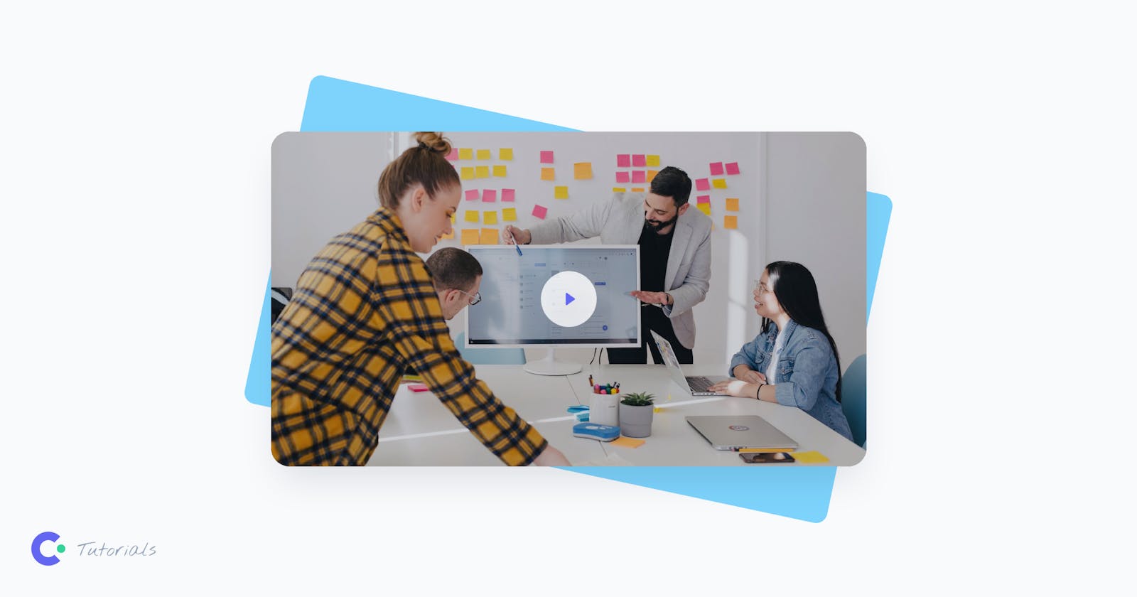
Welcome to the second part of the series of How to Build a Video Modal Component with Tailwind CSS! In the previous part, we learned how to create a modal video component using Tailwind CSS and Alpine.js. In this article, we will level up the game and show you how to create a reusable component for Next.js using TypeScript.
Before we dive in, it’s important to note that we won’t be covering how to get started with Next.js. We recommend referring to the official documentation for that. Instead, we’ll focus on building the component using Next.js 13 with the App Router (app) and React Server Components.
If you’re interested in seeing how we previously built some modal video components in Next.js, we suggest checking out Tidy, an elegant HTML website template, and Appy, a mobile web design template!
Let’s start by sketching out our component by creating a file called modal-video.tsx and defining the function to export.
'use client'

export default function ModalVideo() {
    return (
    <div>

        {/* 1. The button */}
        {/* 2. The backdrop layer */}
        {/* 3. The modal video */}

    </div>
    )
}
For the structure, we are using the same HTML structure we created before with Tailwind CSS, remembering to replace the class attributes with className to ensure compatibility with React.
Additionally, we use the 'use client' directive at the top of the file and before any imports because we know that this component requires client-side interactivity.
Define the modal initial state with useState
Now, let’s define the initial state of the modal, whether it should be open or closed. We can achieve this by using the useState hook from React and setting the initial state to false.
By setting the initial state of the modal, we ensure that it’s closed by default. Later, we’ll create a function that updates the state of the modal when a user interacts with it. This way, the modal will only appear when a user clicks on the thumbnail.
'use client'

export default function ModalVideo() {
    const [modalOpen, setModalOpen] = useState<boolean>(false)

    return (
    <div>

        {/* 1. The button */}
        {/* 2. The backdrop layer */}
        {/* 3. The modal video */}

    </div>
    )
}
Toggling the modal state
Now that we’ve defined the initial state of the modal, let’s move on to toggling its state. To achieve this, add the button markup to our component and include an onClick event that changes the modalOpen state variable to true.
By doing this, we’ll trigger the modal to open when the user clicks on the thumbnail.
'use client'

import Image from 'next/image'
import VideoThumb from '@/public/modal-video-thumb.jpg'

export default function ModalVideo() {
    const [modalOpen, setModalOpen] = useState<boolean>(false)

    return (
    <div>

        {/* 1. The button */}
        <button
        className="relative flex justify-center items-center focus:outline-none focus-visible:ring focus-visible:ring-indigo-300 rounded-3xl group"
        onClick={() => { setModalOpen(true) }}
        aria-label="Watch the video"
        >
        <Image className="rounded-3xl shadow-2xl transition-shadow duration-300 ease-in-out" src={VideoThumb} width={768} height={432} priority alt="Modal video thumbnail" />
        {/* Play icon */}
        <svg className="absolute pointer-events-none group-hover:scale-110 transition-transform duration-300 ease-in-out" xmlns="http://www.w3.org/2000/svg" width="72" height="72">
            <circle className="fill-white" cx="36" cy="36" r="36" fillOpacity=".8" />
            <path className="fill-indigo-500 drop-shadow-2xl" d="M44 36a.999.999 0 0 0-.427-.82l-10-7A1 1 0 0 0 32 29V43a.999.999 0 0 0 1.573.82l10-7A.995.995 0 0 0 44 36V36c0 .001 0 .001 0 0Z" />
        </svg>
        </button>

        {/* 2. The backdrop layer */}
        {/* 3. The modal video */}

    </div>
    )
}
Handling modal visibility and adding enter / leave transitions
Now that we can toggle the modal state, we need to make sure that the visibility of the backdrop layer and the modal video are linked to the modalOpen state variable. Additionally, we want to add enter and leave transitions every time the modal is opened or closed.
One option is to use the React Transition Group library to achieve this, but we should also handle accessibility, and integrate the component with functions that close the modal when the backdrop layer is clicked or the escape key is pressed.
Alternatively, we can use a pre-built UI component that handles all of this for us: Headless UI. Headless UI is a library of fully accessible UI components made by the creators of Tailwind CSS. It includes a bunch of ready-to-use components, including menu, popover, tabs, dialog, and more.
To get started with Headless UI, first install it using the simple Terminal command npm install @headlessui/react@latest. Once installed, import the Dialog and Transition components and define the structure of the backdrop layer and the modal video, as shown in the following example:
'use client'

import { useState, Fragment } from 'react'
import { Dialog, Transition } from '@headlessui/react'
import Image from 'next/image'

export default function ModalVideo() {
    const [modalOpen, setModalOpen] = useState<boolean>(false)

    return (
    <div>

        {/* 1. The button */}
        <button
        className="relative flex justify-center items-center focus:outline-none focus-visible:ring focus-visible:ring-indigo-300 rounded-3xl group"
        onClick={() => { setModalOpen(true) }}
        aria-label="Watch the video"
        >
        <Image className="rounded-3xl shadow-2xl transition-shadow duration-300 ease-in-out" src={thumb} width={thumbWidth} height={thumbHeight} priority alt="Modal video thumbnail" />
        {/* Play icon */}
        <svg className="absolute pointer-events-none group-hover:scale-110 transition-transform duration-300 ease-in-out" xmlns="http://www.w3.org/2000/svg" width="72" height="72">
            <circle className="fill-white" cx="36" cy="36" r="36" fillOpacity=".8" />
            <path className="fill-indigo-500 drop-shadow-2xl" d="M44 36a.999.999 0 0 0-.427-.82l-10-7A1 1 0 0 0 32 29V43a.999.999 0 0 0 1.573.82l10-7A.995.995 0 0 0 44 36V36c0 .001 0 .001 0 0Z" />
        </svg>
        </button>

        <Transition show={modalOpen} as={Fragment}>
        <Dialog onClose={() => setModalOpen(false)}>

            {/* 2. The backdrop layer */}
            <Transition.Child
            className="fixed inset-0 z-[99999] bg-black bg-opacity-50 transition-opacity"
            enter="transition ease-out duration-200"
            enterFrom="opacity-0"
            enterTo="opacity-100"
            leave="transition ease-out duration-100"
            leaveFrom="opacity-100"
            leaveTo="opacity-0"
            aria-hidden="true"
            />

            {/* 3. The modal video */}
            <Transition.Child
            className="fixed inset-0 z-[99999] flex p-6"
            enter="transition ease-out duration-300"
            enterFrom="opacity-0 scale-75"
            enterTo="opacity-100 scale-100"
            leave="transition ease-out duration-200"
            leaveFrom="opacity-100 scale-100"
            leaveTo="opacity-0 scale-75"
            >
            <div className="max-w-5xl mx-auto h-full flex items-center">
                <Dialog.Panel className="w-full max-h-full rounded-3xl shadow-2xl aspect-video bg-black overflow-hidden">
                <video width="1920" height="1080" loop controls>
                    <source src="/video.mp4" type="video/mp4" />
                    Your browser does not support the video tag.
                </video>
                </Dialog.Panel>
            </div>
            </Transition.Child>

        </Dialog>
        </Transition>

    </div>
    )
}
The Transition component is a part of the Headless UI library that allows you to animate content based on its visibility.
When the modalOpen state variable is set to true, the Transition component will show the content wrapped inside it. This is done by passing the modalOpen variable to the show property.
The Transition component has two Transition.Child components that wrap the backdrop and modal video separately. Each Transition.Child component has its own set of properties to define how it should appear and disappear when the modal opens and closes. These properties are defined in the following properties:
enter: Defines the CSS transition property when the component is entering.enterFrom: Defines the starting state of the transition when the component is entering.enterTo: Defines the ending state of the transition when the component is entering.leave: Defines the CSS transition property when the component is leaving.leaveFrom: Defines the starting state of the transition when the component is leaving.leaveTo: Defines the ending state of the transition when the component is leaving.
Next, we have the Dialog component which includes an onClose callback that triggers when the user clicks outside the Dialog.Panel or presses the escape key. We’ll use this callback to set the modalOpen state to false.
At this point, our modal video is fully functional! The final step is to ensure that the video plays automatically when the modal is opened. Let’s take a look at how we can achieve this.
Playing the video automatically when the modal opens
Unlike the Alpine.js example we showed in the previous article, in Next.js, the modal content gets unmounted when the modal is closed. For this reason, we don’t need to worry about pausing the video when the modal is closed, and we’ll only focus on starting the video when it opens.
To do this, we need to reference the video and tell it to start playing. We can’t use the usual useEffect React hook because the video is inside a component that gets unmounted when the modal closes, and the ref would return null.
Instead, we’ll use the afterEnter callback in the Transition component. This callback runs after the modal has finished opening, so we can access the video element through the ref and tell it to play.
'use client'

import { useState, useRef, Fragment } from 'react'
import { Dialog, Transition } from '@headlessui/react'
import Image from 'next/image'

export default function ModalVideo() {
    const [modalOpen, setModalOpen] = useState<boolean>(false)

    return (
    <div>

        {/* 1. The button */}
        <button
        className="relative flex justify-center items-center focus:outline-none focus-visible:ring focus-visible:ring-indigo-300 rounded-3xl group"
        onClick={() => { setModalOpen(true) }}
        aria-label="Watch the video"
        >
        <Image className="rounded-3xl shadow-2xl transition-shadow duration-300 ease-in-out" src={thumb} width={thumbWidth} height={thumbHeight} priority alt="Modal video thumbnail" />
        {/* Play icon */}
        <svg className="absolute pointer-events-none group-hover:scale-110 transition-transform duration-300 ease-in-out" xmlns="http://www.w3.org/2000/svg" width="72" height="72">
            <circle className="fill-white" cx="36" cy="36" r="36" fillOpacity=".8" />
            <path className="fill-indigo-500 drop-shadow-2xl" d="M44 36a.999.999 0 0 0-.427-.82l-10-7A1 1 0 0 0 32 29V43a.999.999 0 0 0 1.573.82l10-7A.995.995 0 0 0 44 36V36c0 .001 0 .001 0 0Z" />
        </svg>
        </button>

        <Transition show={modalOpen} as={Fragment} afterEnter={() => videoRef.current?.play()}>
        <Dialog initialFocus={videoRef} onClose={() => setModalOpen(false)}>

            {/* 2. The backdrop layer */}
            <Transition.Child
            className="fixed inset-0 z-[99999] bg-black bg-opacity-50 transition-opacity"
            enter="transition ease-out duration-200"
            enterFrom="opacity-0"
            enterTo="opacity-100"
            leave="transition ease-out duration-100"
            leaveFrom="opacity-100"
            leaveTo="opacity-0"
            aria-hidden="true"
            />

            {/* 3. The modal video */}
            <Transition.Child
            className="fixed inset-0 z-[99999] flex p-6"
            enter="transition ease-out duration-300"
            enterFrom="opacity-0 scale-75"
            enterTo="opacity-100 scale-100"
            leave="transition ease-out duration-200"
            leaveFrom="opacity-100 scale-100"
            leaveTo="opacity-0 scale-75"
            >
            <div className="max-w-5xl mx-auto h-full flex items-center">
                <Dialog.Panel className="w-full max-h-full rounded-3xl shadow-2xl aspect-video bg-black overflow-hidden">
                <video ref={videoRef} width="1920" height="1080" loop controls>
                    <source src="/video.mp4" type="video/mp4" />
                    Your browser does not support the video tag.
                </video>
                </Dialog.Panel>
            </div>
            </Transition.Child>

        </Dialog>
        </Transition>

    </div>
    )
}
Lastly, to ensure that the video element is focused when the modal is opened, we can pass the videoRef to the Dialog’s initialFocus property.
With that, the modal video component is now complete and can be imported and used in another component like this:
<ModalVideo />
If you only need to use the component once in your app, then you’re good to go! But if you want to reuse it with different thumbnail images and videos, a few more adjustments may be necessary.
Making the modal video component reusable
To ensure that the ModalVideo component is reusable, we should pass the following properties as props to it:
The source attribute (src) of the thumbnail image
The dimensions of the thumbnail image
The alternative text (alt) for the thumbnail image
The source attribute (src) of the video
The dimensions of the video
<ModalVideo
    thumb={VideoThumb}
    thumbWidth={768}
    thumbHeight={432}
    thumbAlt="Modal video thumbnail"
    video="/video.mp4"
    videoWidth={1920}
    videoHeight={1080} />
We can then read these props by listing their names in the function component. To ensure that the props are properly structured, we’ll also define an object with a TypeScript interface:
interface ModalVideoProps {
    thumb: StaticImageData
    thumbWidth: number
    thumbHeight: number
    thumbAlt: string
    video: string
    videoWidth: number
    videoHeight: number
}

export default function ModalVideo({
    thumb,
    thumbWidth,
    thumbHeight,
    thumbAlt,
    video,
    videoWidth,
    videoHeight,
}: ModalVideoProps) {
...
Conclusions
And here’s the final result of the modal video component built with Next.js, TypeScript and Tailwind CSS:
'use client'

import { useState, useRef, Fragment } from 'react'
import type { StaticImageData } from 'next/image'
import { Dialog, Transition } from '@headlessui/react'
import Image from 'next/image'

interface ModalVideoProps {
    thumb: StaticImageData
    thumbWidth: number
    thumbHeight: number
    thumbAlt: string
    video: string
    videoWidth: number
    videoHeight: number
}

export default function ModalVideo({
    thumb,
    thumbWidth,
    thumbHeight,
    thumbAlt,
    video,
    videoWidth,
    videoHeight,
}: ModalVideoProps) {
    const [modalOpen, setModalOpen] = useState<boolean>(false)
    const videoRef = useRef<HTMLVideoElement>(null)

    return (
    <div>

        {/* Video thumbnail */}
        <button
        className="relative flex justify-center items-center focus:outline-none focus-visible:ring focus-visible:ring-indigo-300 rounded-3xl group"
        onClick={() => { setModalOpen(true) }}
        aria-label="Watch the video"
        >
        <Image className="rounded-3xl shadow-2xl transition-shadow duration-300 ease-in-out" src={thumb} width={thumbWidth} height={thumbHeight} priority alt={thumbAlt} />
        {/* Play icon */}
        <svg className="absolute pointer-events-none group-hover:scale-110 transition-transform duration-300 ease-in-out" xmlns="http://www.w3.org/2000/svg" width="72" height="72">
            <circle className="fill-white" cx="36" cy="36" r="36" fillOpacity=".8" />
            <path className="fill-indigo-500 drop-shadow-2xl" d="M44 36a.999.999 0 0 0-.427-.82l-10-7A1 1 0 0 0 32 29V43a.999.999 0 0 0 1.573.82l10-7A.995.995 0 0 0 44 36V36c0 .001 0 .001 0 0Z" />
        </svg>
        </button>
        {/* End: Video thumbnail */}

        <Transition show={modalOpen} as={Fragment} afterEnter={() => videoRef.current?.play()}>
        <Dialog initialFocus={videoRef} onClose={() => setModalOpen(false)}>

            {/* Modal backdrop */}
            <Transition.Child
            className="fixed inset-0 z-10 bg-black bg-opacity-50 transition-opacity"
            enter="transition ease-out duration-200"
            enterFrom="opacity-0"
            enterTo="opacity-100"
            leave="transition ease-out duration-100"
            leaveFrom="opacity-100"
            leaveTo="opacity-0"
            aria-hidden="true"
            />
            {/* End: Modal backdrop */}

            {/* Modal dialog */}
            <Transition.Child
            className="fixed inset-0 z-10 flex p-6"
            enter="transition ease-out duration-300"
            enterFrom="opacity-0 scale-75"
            enterTo="opacity-100 scale-100"
            leave="transition ease-out duration-200"
            leaveFrom="opacity-100 scale-100"
            leaveTo="opacity-0 scale-75"
            >
            <div className="max-w-5xl mx-auto h-full flex items-center">
                <Dialog.Panel className="w-full max-h-full rounded-3xl shadow-2xl aspect-video bg-black overflow-hidden">
                <video ref={videoRef} width={videoWidth} height={videoHeight} loop controls>
                    <source src={video} type="video/mp4" />
                    Your browser does not support the video tag.
                </video>
                </Dialog.Panel>
            </div>
            </Transition.Child>
            {/* End: Modal dialog */}

        </Dialog>
        </Transition>

    </div>
    )
}
The nice thing about this component is that by passing props for the thumbnail and the video, you can easily use it in different parts of your application.
If you’re interested in learning how to build this component in other stacks, here are the links to the first and third parts of the series: